I try to read a lot of research. Here’s a brief description of an interesting study that is probably flawed in its methodology.
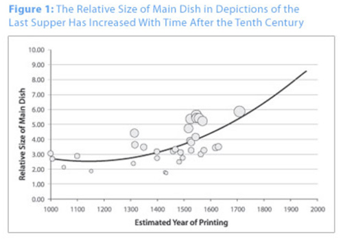
Wansink and Wansink (2010) gathered 52 depictions of The Last Supper painted over the last 1000 years. The researchers analyzed each painting using a program that calculated the relative size of the disciple’s heads to the size of the bread, main dish, and serving plates on the table.
What Wansink and Wansink found is that main dish size, bread size, and plate size are all positively correlated with the date of the painting (though these effect sizes don’t explain too much of the statistical variance).

These are interesting findings, but I’m not totally convinced they are due to food resources generally becoming more available over the last millenium, as the authors posit. Rather, you’ll notice a clump of paintings between 1500 and 1600 that are weighing the curve upward and creating the statistically significant effect. Is this error, or real variance?
A major threat to this study’s validity lies in selection bias. Wansink and Wansink sampled paintings using criteria offered by the editors of a book of Last Supper art. Because the authors do not report why this criteria works as a practical control for the aims of their study, we can speculate that there’s a strong likelihood of systematic selection bias.
References
Wansink, B., & Wansink, C.S. (2010). The largest last supper: Depictions of portion size and plate size increased over the millenium. The International Journal of Obesity. In press.